Everyone, the rich and the poor have one thing in common, 24 hours a day,- Jerry Calvin Mwenda
MAKING DJANGO ADMIN GREAT AGAIN!
In this publication, you will learn how to graphically display data on django admin and basically turn it to a dashboard of sorts. There are numerous ways of building custom dashboards, however one has to accrue constraints from time, huge database quries, speed, data integrity, security risks….. yada yada
Goal:
- Create tabular visualization of the data
- Create Graphical visualization of the data
 or more
HOW TO
install requirements.txt
We will create a simple lending app which the stakeholders would like a summary display of repayments over a period of the last 3 day period
Lets Create a very simple model:
from django.db import models
import  datetime
from django.contrib.auth.models import User
class LoanRepayments(models.Model):
    mobile_number=models.CharField(max_length=100)
    amount=models.IntegerField()
    date=models.DateTimeField(default=datetime.datetime.now)
    #make sure to add the part below
    class Meta:
        ordering=['-date']
        verbose_name='Loan Repayment'
        verbose_name_plural="Loan Repayments"
    def __str__(self):
        return self.mobile_number
and a simple admin all together
from django.contrib import admin
from metrics.models import LoansRepaid
@admin.register(LoansRepaid)
class LoansRepaidAdmin(admin.ModelAdmin):
    pass
Creating Tabular Visualization
SHOW US THE CODE!
change_list_template = 'admin/loans.html'
def changelist_view(self, request, extra_context=None):
    try:
        response=super().changelist_view(request,extra_context=extra_context)
        queryset=response.context_data['cl'].queryset
        response.context_data['data']=list(
            queryset
            .values('id','mobile_number','amount')
            .order_by('id')
        )
        return response
    except Exception as e:
        return response
HOLD UP!
what is all this if you may ask!
What this does is: super() this method allows changelist_view inherit/refer to other django predefined classes without explicitly naming them
queryset - gets the queryset recieved from the context
Finally we return a list of values we would like to send to the template
From here you need to create a html file under templates/admin and name it loans.html : copy the following code Lol, no seriously copy the code
{% extends "admin/change_list.html" %}
{% load staticfiles %}
{% block content_title %}
<p>LOANS</p>
{% endblock %}
{% block result_list %}
<style>
table {
border-collapse: collapse;
width: 100%;
margin-bottom: 100px;
}
td, th {
border: 1px solid #43768F;
text-align: left;
padding: 8px;
}
tr:nth-child(even) {
background-color: #D7ECFA;
}
</style>
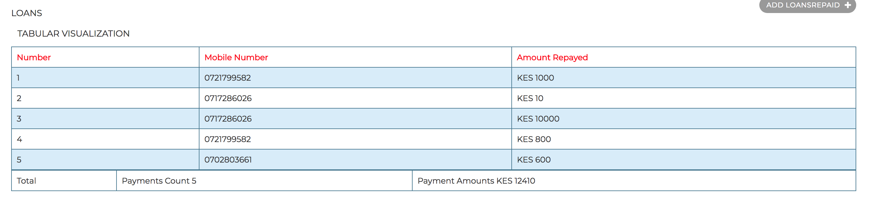
<p>TABULAR VISUALIZATION</p>
<table>
<tr style="color: red">
<th>Number</th>
<th>Mobile Number</th>
<th>Amount Repayed</th>
</tr>
{% for data in data %}
<tr>
<td>{{ data.id }}</td>
<td> {{ data.mobile_number }}</td>
<td> KES {{ data.amount }}</td>
</tr>
{% endfor %}
</table>
{% endblock %}
{% block pagination %}{% endblock %}
Simple enough huh?
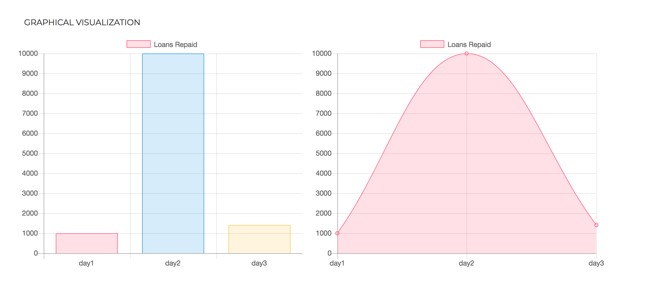
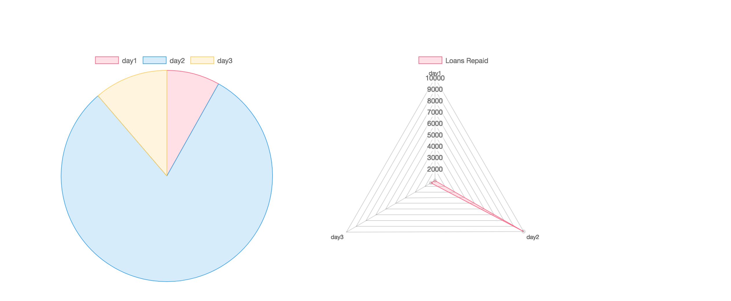
Creating Graphical visualization
roses are red violets are blue, talk is cheap!, show us the code
Dashboards are known worldwide for thier graphs. We must get one for our dashboard, Since we want to inject our own logic to django admin we will use ChangeList.
As usual:
class LoansRepaidChangeList(ChangeList):
    def get_results(self, request):
        super(LoansRepaidChangeList,self).get_results(request)
        #create your rules to get the data you want
        # create dict
        response = {}
        response['data'] = {}
        response['data']['labels'] = ['day1', 'day2', 'day3']
        response['data']['datasets'] = [{
            'label': 'Loans Repaid',
            'data': [10, 20, 30],
            'backgroundColor': [
                'rgba(255, 99, 132, 0.2)',
                'rgba(54, 162, 235, 0.2)',
                'rgba(255, 206, 86, 0.2)',
                'rgba(75, 192, 192, 0.2)',
                'rgba(153, 102, 255, 0.2)',
                'rgba(255, 159, 64, 0.2)'
            ],
            'borderColor': [
                'rgba(255,99,132,1)',
                'rgba(54, 162, 235, 1)',
                'rgba(255, 206, 86, 1)',
                'rgba(75, 192, 192, 1)',
                'rgba(153, 102, 255, 1)',
                'rgba(255, 159, 64, 1)'
            ],
            'borderWidth': 1
        }]
        self.data=response['data']
Arrgh! There we go with the super method again!
Here we need to create rules to which we will obtain our data with, for example
yourmodel.objects.filter(condition=''').aggregate(Sum('field'))[ 'field__sum']
Then we create the graph.
Some key point to note are:
lables - this is equivalent to title data this is a list of the values you would want to plot
NOTE lables and data must have an equivalent matrix
Lets add this to our admin model. Here’s the full admin model
@admin.register(LoansRepaid)
class LoansRepaidAdmin(admin.ModelAdmin):
    change_list_template = 'admin/loans.html'
    def get_changelist(self, request, **kwargs):
        return LoansRepaidChangeList
    def changelist_view(self, request, extra_context=None):
        try:
            response=super().changelist_view(request,extra_context=extra_context)
            queryset=response.context_data['cl'].queryset
            response.context_data['data']=list(
                queryset
                .values('id','mobile_number','amount')
                .order_by('id')
            )
            return response
        except Exception as e:
            return response
Now Let’s ad this to out html
{% extends "admin/change_list.html" %}
{% load staticfiles %}

{% block content_title %}


<p>LOANS</p>

{% endblock %}


{% block result_list %}
    <style>
table {
    border-collapse: collapse;
    width: 100%;
    margin-bottom: 100px;
}

td, th {
    border: 1px solid #43768F;
    text-align: left;
    padding: 8px;
}

tr:nth-child(even) {
    background-color: #D7ECFA;
}
</style>
<p>TABULAR VISUALIZATION</p>
<table>
  <tr style="color: red">
    <th>Number</th>
    <th>Mobile Number</th>
    <th>Amount Repayed</th>
  </tr>
 {% for data in data %}
      <tr>
    <td>{{ data.id }}</td>
    <td> {{ data.mobile_number }}</td>
    <td> KES {{ data.amount }}</td>
  </tr>
{% endfor %}

</table>

<p>GRAPHICAL VISUALIZATION</p>
<div class="chart" style="height: 500px;width: 500px;overflow: scroll;float: left;">
  <canvas  id="bargraph" width="500" height="400"></canvas>

</div>
    <div class="chart" style="height: 500px;width: 500px;overflow: scroll;float: left;">
  <canvas  id="linegraph" width="500" height="400"></canvas>

</div>

        <div class="chart" style="height: 500px;width: 500px;overflow: scroll;float: left;">
  <canvas  id="piechart" width="500" height="400"></canvas>

</div>

     <div class="chart" style="height: 500px;width: 500px;overflow: scroll;">
  <canvas  id="radarhart" width="500" height="400"></canvas>

</div>


        <script type="text/javascript" src="http://code.jquery.com/jquery-1.10.0.min.js"></script>
        <script type="text/javascript" src="{% static "js/Chart.min.js" %}"></script>


        <script>
      var ctx = document.getElementById("bargraph").getContext('2d');

var bargraph = new Chart(ctx, {
    type: 'bar',
    data: {{ cl.data|safe }},
    options: {
        scales: {
            yAxes: [{
                ticks: {
                    beginAtZero:true
                }
            }]
        }
    }
});

var ctx2 = document.getElementById("linegraph").getContext('2d');

var linegraph = new Chart(ctx2, {
    type: 'line',
    data: {{ cl.data|safe }},
    options: {
        scales: {
            yAxes: [{
                ticks: {
                    beginAtZero:true
                }
            }]
        }
    }
});

var ctx3 = document.getElementById("piechart").getContext('2d');

var piechart = new Chart(ctx3, {
    type: 'pie',
    data: {{ cl.data|safe }},

});


var ctx4 = document.getElementById("radarhart").getContext('2d');

var radarhart = new Chart(ctx4, {
    type: 'radar',
    data: {{ cl.data|safe }},

});
        </script>


{% endblock %}

{% block pagination %}{% endblock %}
BONUS
Lets make our table have totals
Get sum and totals
data={}
data['totalrepayments']=Count('id')
data['totalrepaymentamounts']=Sum('amount')
then add this to context
response.context_data['totals']=dict(
queryset.aggregate(**data)
            )
Finally add the table to html:
<table style="margin-bottom: 100px;color: #333333">

       <tr>
           <td>Total</td>
           <td>Payments Count {{ totals.totalrepayments  }} </td>
           <td>Payment Amounts KES  {{ totals.totalrepaymentamounts}} </td>
       </tr>
   </table>
we will finally have